Introducing Our New Website

Recently, I spent a few sentimental minutes — thanks to the Internet Archive’s “Wayback Machine” — browsing the Observer’s website from the late ’90s. George W. Bush was still governor, and people unironically discussed the “The Information Superhighway,” which they surfed using dial-up modems. Our site, which we called “the Down Home Page,” was… rustic, to be kind. Each issue was dumped online, a swath of text without accompanying images. A counter helpfully noted that on Feb. 4, 1998, the Down Home Page had had 24,000 visitors or so. On the About page, we promised that our print tradition of “watch-dogging and boat-rocking with a vengeance” would be continued “on the good ‘ole WWW.”
Seventeen years later, the good ol’ WWW has come a long way and so has the Observer’s digital presence.
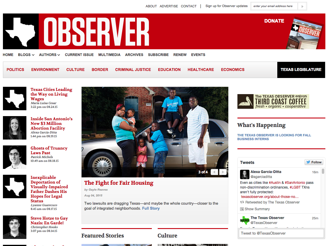
Today, after nearly a year of work, we launch a redesigned texasobserver.org. In my decade at the Observer, we’ve overhauled our site three times — a testament to how important the web has become. We’re the first ones to admit that the Observer was not necessarily at the forefront of digital innovation, and historically, our print magazine overshadowed the website. But as with many publications, that has changed emphatically in recent years. We have moved away from treating the web as a secondary platform for the print magazine. Instead, we’ve made texasobserver.org a daily site that stays true to our principles while adapting to a digital environment.
We have more readers online, by far, than we do in print and the number is growing rapidly. Still, the core of our identity remains unchanged: longform storytelling and investigative reporting that challenges authority, gives voice to the marginalized, and makes people think.
The new site greatly improves the reading experience, especially for features. A few highlights:
- It’s, well, prettier: The clean, uncluttered design elevates the story above other web elements. We selected a typeface that lets the words “breathe.” Our team redesigned pullquotes and images to pace readers tackling complex long-read articles.
- Easier to navigate: The new Observer homepage dispenses with the artificial distinction between “blogs” and features, and it allows us to curate stories so that we can keep evergreen magazine stories front-and-central longer, re-up old stories that may become relevant again and more dynamically manage our forward-facing site on a daily basis.
- Responsive and customizable: The new site is fine-tuned to work on mobile and tablet devices as well as desktops. It also de-emphasizes comments. So if you’re not interested in our pet troll 1bimbo’s fevered rants, you won’t have to see them. We also have greater freedom to customize pages, allowing us to incorporate visual and multimedia elements into features in a way that does our features justice.
- Social: We’ve made it as easy as possible to share our stories on social media, reflecting the steadily increasing stream of readers finding the Observer via Facebook and Twitter.
Thanks to the efforts of the Observer staff, especially Michael Schrantz and Tess Bonn, as well as our design team, Workhorse Marketing, we are really proud of our new Down Home Page. Let us know what you think.
You May Also Like
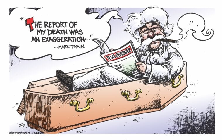
The Texas Observer Lives!
After a terrifying near-death experience, we live to muckrake another day.
The Observer’s Best Longform Stories of 2020
We rounded up some of our hardest hitting longform stories from this unprecedented year.