
Democrats Outclass Republicans on Graphic Design
A version of this story ran in the September 2014 issue.
When the David Dewhurst campaign slapped a spinning bowtie on state Sen. Dan Patrick this spring, I knew Texas voters were in for something special in 2014, something that screams “elevated political discourse.”
Ideologically, every tea party race is a race to the bottom, but the guys vying for the Republican lieutenant governor nomination made sure the campaign aesthetics matched the overall tenor of the conversation: vague, sloppy, carnivalesque.
Hence the spinning red bowtie pasted on a dancing Dan Patrick GIF featured on the now-defunct attack site TheRealDanPatrick.com, which made it appear as though the scariest thing about Dan Patrick is the possibility that he might try guessing your weight.
The pre-primary exchanges between Dewhurst and Patrick read as little more than juvenile schoolyard tiffs, scuffles between the boy whose daddy runs the factory and the boy whose daddy runs the coal mine, and Patrick ultimately trounced Dewhurst to secure the nomination.
It’s probably a good thing we lost “Mountain Dew” back in May. One shudders to consider the chicanery his team might have pulled on Democrat opponent Leticia Van de Putte, an eminently qualified lieutenant gubernatorial candidate with the well-earned gravitas of a longtime stateswoman and a clean, forward-thinking campaign aesthetic that reflects the same.
Particularly for Democrats, good design can build a bridge between unengaged voters and the candidates who need their support if anything is to change this November.
The Wendy Davis and Van de Putte campaigns cast a wide, generally well-designed net, their Twitter feeds full of grinning candidate photos and pithy quotes artfully arranged for Facebook users who love to post inspirational memes. Not feeling the stark, square, official “Wendy Davis For Texas” logo? Grab yourself a blue, cursive, “Generation Wendy” sign. Want to signal your support for a Latina lieutenant governor? There’s a “Viva Leticia” sign for that.
Meanwhile, the Dan Patrick campaign is constantly searching for new fonts in which to print “SECURE THE BORDER,” and GOP attorney general candidate Ken Paxton’s website features an unsettling and poorly clipped lineup of floating-head endorsements from right-wing lawmakers and lobbyists. Greg Abbott renders his name in a blocky, blue, seriffed type on a white background, which looks especially cheap on T-shirts, like something your church might print for its fall fun-run.
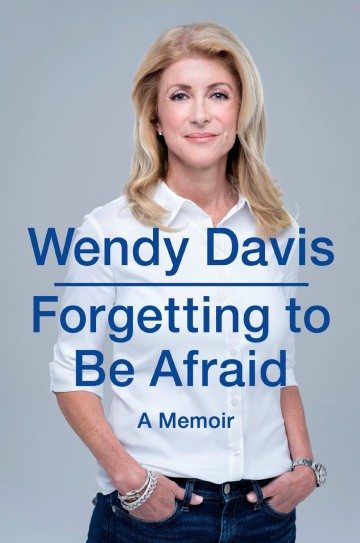
And yet the most notable design flub of any 2014 campaign so far is the inexplicably cringe-worthy cover of Davis’ memoir, scheduled for release this month. Davis is posed as if being photographed by the lesser of a very small town’s two portrait makers, then Photoshopped onto a despair-gray background. The title (Forgetting to Be Afraid—not so bad as fluffy political memoirs go) floats directly over her torso in an insubstantial blue sans-serif font that might be named “error: font not found.”
It looks like the cover of a self-published e-book, and we are going to see it over and over as journalists, talk-show hosts and reviewers plumb it for clues about what kind of governor Wendy Davis might be.
But shouldn’t voters cast ballots based on issues? Why should anyone care about kerning while the state’s water runs dry and our public education system is slated for sale to the highest charter-school bidder?
Particularly for Democrats, good design can build a bridge between unengaged voters and the candidates who need their support if anything is to change this November. It makes perfect sense that Democrats would try to wrap their appeals in prettily designed bows, and that Republicans wouldn’t bother.
Everything about the Republican reliance on stodgy serifs says, “Don’t you like things the way they are?” while everything about the Democrats’ aesthetically accessible imagery—some of which is sourced directly from fan-like supporters who love making Wendy Davis sneaker cakes and Photoshopping the candidate as the “mother of dragons” a la Game of Thrones—says, “We’re as different as y’all are.”
How that will play out in November remains to be seen, but if elections were won in Adobe Illustrator, Texas would turn blue in a brushstroke.
You May Also Like
Trump’s Texas Tycoons
Meet the Lone Star megadonors, think tankers, and politicians poised to play big roles in Trump’s comeback tour.

Texas (Kinda, Sorta) Accidentally Decriminalized Weed. Now What?
How harshly you’re punished for pot possession depends on where you’re caught, even more so now that a new law legalizing hemp has sowed confusion.
The ‘Crazies’ Have Fully Taken Over the Texas GOP
At the state GOP convention, Dan Patrick said his side had “won.” He’s right.