ustxtxb_obs_1971_09_24_50_00012-00000_000.pdf
Page 5
The Texas Observer REGISTER1 .7..:., BUMPERSTRIPS: 4 for 50c, 15 for $1, 100 for $3, 500 for $14, 1,000 for $25. Send check and Zip Code; we pay postage and tax. IIFFUTURA PRESS ,., 12 Ir Phone 512/442-7836 1714 SOUTH CONGRESS P.O. 80X 3485 A1M-IN. TFXAQ Since 1866 The Place in Austin GOOD FOOD GOOD BEER 1607 San Jacinto 477-4171 the shock waves of which have not yet hit. Following hard on the heels of a series of exhibitions held at the Whitney Museum, in Boston and most recently in Geneva, this too is an exhibition which includes black artists but with a monumentally important difference. This is neither a “Black Exhibition” \(usually of social protest art or art with black subject Artists” \(many of whom are exhibited because they are black not because of the “mainstream” exhibition which happens to have some black artists in it. It is relatively easy to choose up sides and argue the relative merits of “Black Art,” “Black Artists” and the influence of African Ancestry it is a convoluted dialectic. The critical literature of the past three years is full of pros and cons and heated disagreements. Suffice it to say my personal interest lies primarily in the quality of the art. The rest is politics and sociology. That point having been made, I choose not to discuss the blackness or whiteness of any given artist from here on out. THE EXHIBITION WAS, I suspect, chosen particularly for the strength of its visual impact. Its inclusions read like a portion of the “Who’s Who” of color painting. Color painters those who depend primarily or solely upon color as structure have been either much enshrined or much berated depending upon which side of the critical fence one is on. It is a difficult area in which to work. Freed almost entirely of Cubist concerns for space and from pictorial elements, the color painter must say what he has to say pretty much with color alone and, of course, the shape in which he contains it. The bad ones slide off the edge into prettiness and decorativeness and sometimes the line is very thin. There are no bad painters in this show. It does however have some weaknesses. For the ultimate refinement of the colorist statement, Kenneth Noland wins hands down. The thin, sheer delicacy of his whispered colors is belied by the force and tension of his rushing lines and the tautness of his canvases. Two of his works in the exhibition are not more than ten inches in height and run some six feet in length. These, “Trail Mark,” and “Natural Way,” are both from 1969. They utilize yellow, clay, green, ochre and pink for their primary strength. For all of their delicacy they are as taut and finely-tuned as an instrument. A third work “Rustle” from 1967 is a more standardized size and utilizes narrow bands of blued purple and baby blue to separate flat areas of ochre, beige, yellow and rust in an interwoven orchestration of bands. Sam Gilliam’s “Rather” from 1970 is probably the most spectacular work in the exhibition in terms of bravado and dramatic impact. It is a stained, suspended canvas onto which brilliant vermillion, purple and red have been poured, rubbed, scrubled, dripped and stained. It is hung draped, suspended from four nails in the wall, in a violent Baroque gesture. Looseness and accidental forces are part of both the painting vocabulary and the final hanging. The work is allowed to hang essentially where it will with some urging from the creator. Oddly, I preferred an early hanging rather than the final one which tacked up one end in banner fashion, grounding it and interfering with the fluidity. There is a Jules Olitski in the show from Kenneth Noland’s personal collection entitled “Loosha One, 1970” which has a radiating and sumptuous beauty. The painting is a pink-orange with the kind of halation of color at which Olitski is so good. It is exquisitely controlled and bounded by slashes of gradually fading color in pink, ochre or green along its borders. Larry Poons, whose reputation was made with his “dot” paintings of tightly-controlled shapes against contrasting color fields, was tough enough to realize the corner into which he could anew. The painting in this exhibition is one of the new group, only one of which I had seen previously. It is proof that he is as strong as ever. The work in this exhibition “Untitled, 1971” has a cratered surface of yellowed mustard-orange. It has only vestigial remains of ovaloid shapes in one corner in faintest purple and pink in a kind of echo or homage. Instead of the tight, clean surface of yesteryear, his surface now is thick, cracked, scabby, with rich, almost still wet color which bubbles open to form deep craters of green. THE ONE Darby Bannard in the show, “Perishing Lands” is fairly representative, but not one of my favorites. I admit unashamedly to strong color weaknesses and am sometimes easily seduced, and also conversely to a certain perversity and propensity for Funky color. But some of Bannard’s works are neither \(this is flat, pale yellow-orange and greyed sometimes due to the density of the surface, but more often than not to the specific coloration. Peter Bradley’s works, “Till Now” and “Hemming,” both from 1971, are soft, rich, velvety, lyrical paintings with deep pools of color in lavender and rust out of which rise glimmers of blue, green and salmon color. They are sensuous paintings which appeal immediately. Maybe too much so. I had the strong feeling that one needed to see a larger body of work. Bradley, who organized the show \(should exhibited extensively \(except for early work. At any rate, it is rich and luscious stuff. MONIIIMIIIIIMIN111111111111 111111Ms Call PICK Before You Pack FOR SAN ANTONIO Enjoy real money-saving I value, and relax at the I ALBERT OK/ MOTEL 1 96 N.E. Loop Expressway I Adjacent to San Antonio International Airport Color TV in every room Restaurant & Lounge 1 Heated Pool Family Plan Free Parking ALL AT MODERATE RATES RESERVATIONS: CALL TOLL FREE American Express Space Bank I I 800-AE 8-5000 1 I aneM111101111111 1111111111111111111111111M
You May Also Like
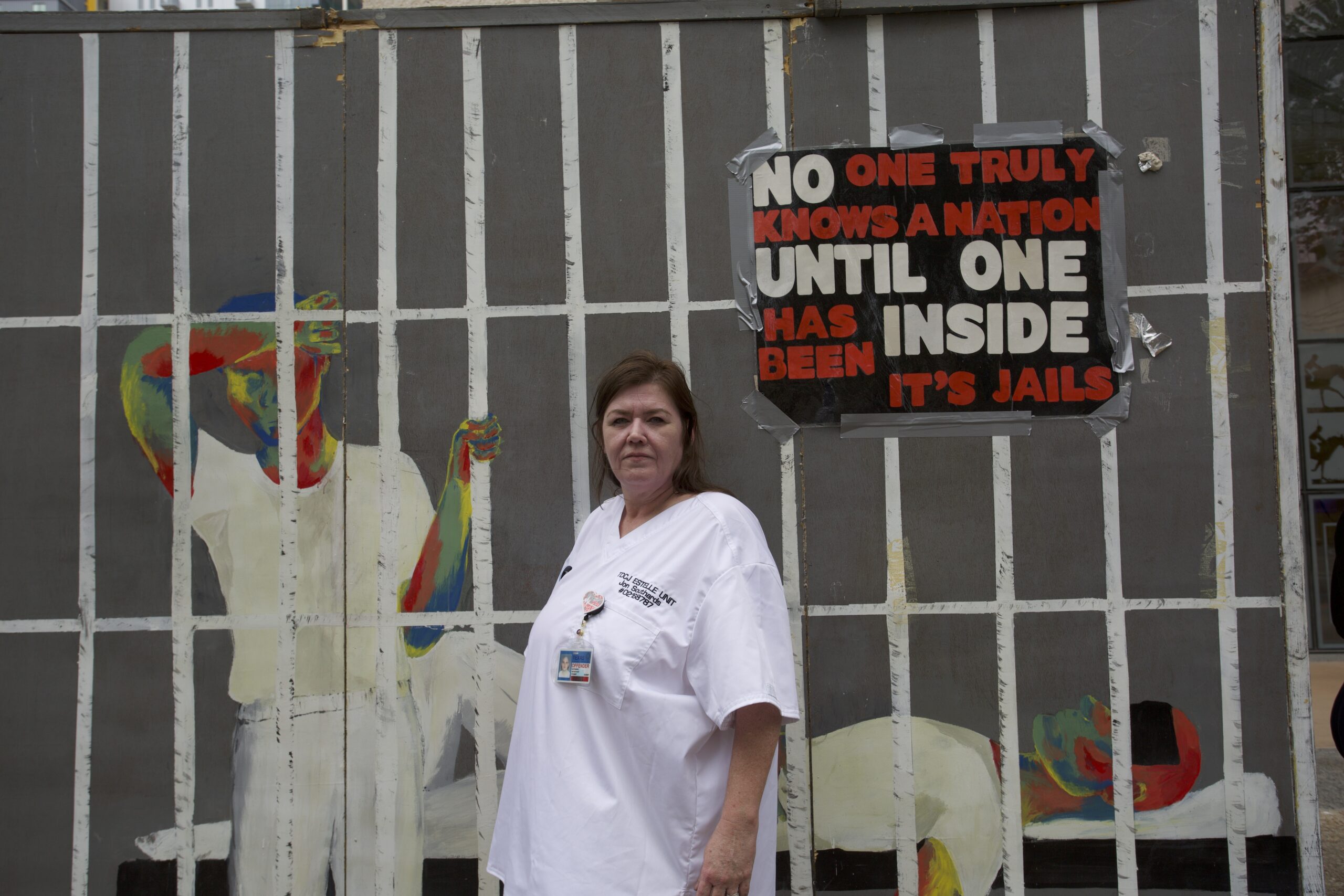
‘There Have to Be Limits’: Lawsuit Urges Scorching Prisons to Cool Down
New plaintiffs have expanded a 2023 lawsuit against TDCJ, accusing the agency of “cooking [prisoners] to death."
‘Forever Chemicals,’ Religion, and Family Tragedy in Texas
PFAS do not break down but rather persist indefinitely. It is possible that Dad drank carcinogenic water for most of his life.